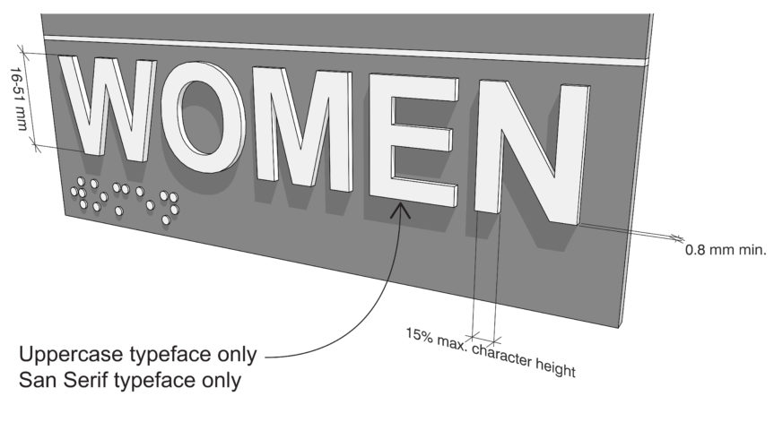
703.2 – Raised Characters
703.2 Raised Characters.
Raised characters shall comply with 703.2 and shall be duplicated in braille complying with 703.3. Raised characters shall be installed in accordance with 703.4.
703.2.1 Depth.
Raised characters shall be 0.8 mm (1/32″) minimum above their background.
703.2.2 Case.
Characters shall be uppercase.
703.2.3 Style.
Characters shall be sans serif. Characters shall not be italic, oblique, script, highly decorative, or of other unusual forms.
703.2.4 Character Proportions.
Characters shall be selected from fonts where the width of the uppercase letter “O” is 55 percent minimum and 110 percent maximum of the height of the uppercase letter “I”.
703.2.5 Character Height.
Character height measured vertically from the baseline of the character shall be 16 mm (5/8″) minimum and 51 mm (2″) maximum based on the height of the uppercase letter “I”.
703.2.6 Stroke Thickness.
Stroke thickness of the uppercase letter “I” shall be 15 percent maximum of the height of the character.
703.2.7 Character Spacing.
Character spacing shall be measured between the two closest points of adjacent raised characters within a message, excluding word spaces. Where characters have rectangular cross sections, spacing between individual raised characters shall be 3.2 mm (1/8″) minimum and 4 times the raised character stroke width maximum. Where characters have other cross sections, spacing between individual raised characters shall be 1.6 mm (1/16″) minimum and 4 times the raised character stroke width maximum at the base of the cross sections, and 3.2 mm (1/8″) minimum and 4 times the raised character stroke width maximum at the top of the cross sections. Characters shall be separated from raised borders and decorative elements 9.5 mm (3/8″) minimum.
703.2.8 Line Spacing.
Spacing between the baselines of separate lines of raised characters within a message shall be 135 percent minimum and 170 percent maximum of the raised character height.